

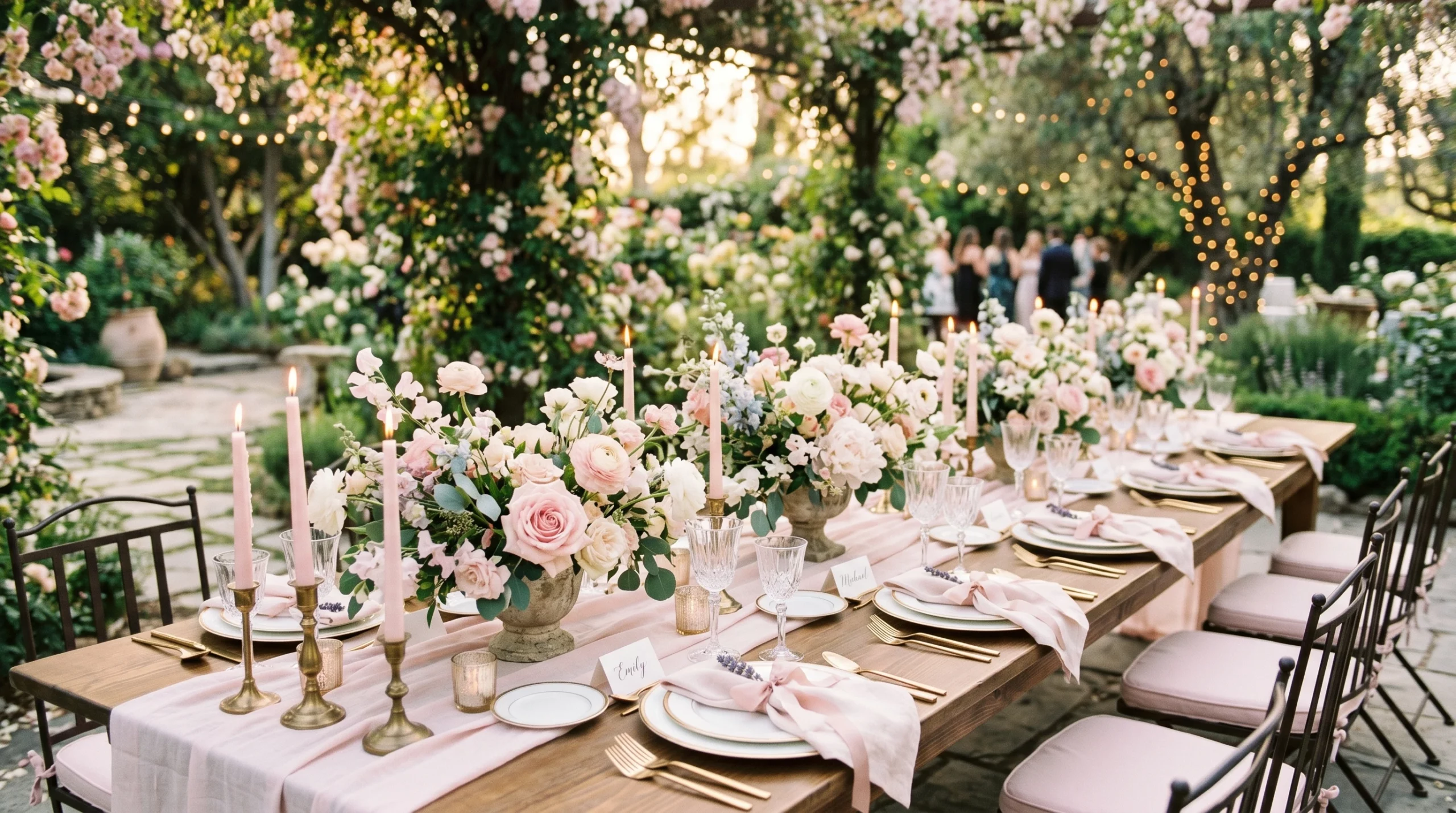
Pale pink has a way of mixing up a wedding atmosphere from everyday to soft, romantic, and completely inviting. I get excited every time a couple leans toward an organic, pale pink color palette. There’s just something naturally pretty about it, especially in natural light when everything glows a little brighter and looks that much softer. Pale pink is subtle, never overwhelming, and when paired with toneddown neutrals and gentle green, it just fits right into a natureinspired wedding style.
Creating the Pale Pink Mood
Weddings in pale pink feel instantly calm and welcoming. The color never takes over the space but quietly warms the setting. When sunlight filters in and touches pale pink table runners, blushhued peonies, or silk bouquet ribbons, it all feels airy and timeless. There’s a reason why so many classic celebrations and modern gatherings keep circling back to this shade.
Think about gardeninspired spaces or venues with big windows and lots of sunlight. Here, pale pink looks its dreamiest, from morning brunches to golden hour receptions. The organic side comes out when you work in natural fabrics, loosely arranged florals, and tablescapes styled with soft, textured neutrals. Everything feels laid back yet really personal and beautiful. The subtlety of pale pink ties into a variety of event styles—rustic barn weddings, beach ceremonies, and traditional ballroom celebrations all become more inviting when this tone works its magic.
Pairing Colors with Pale Pink
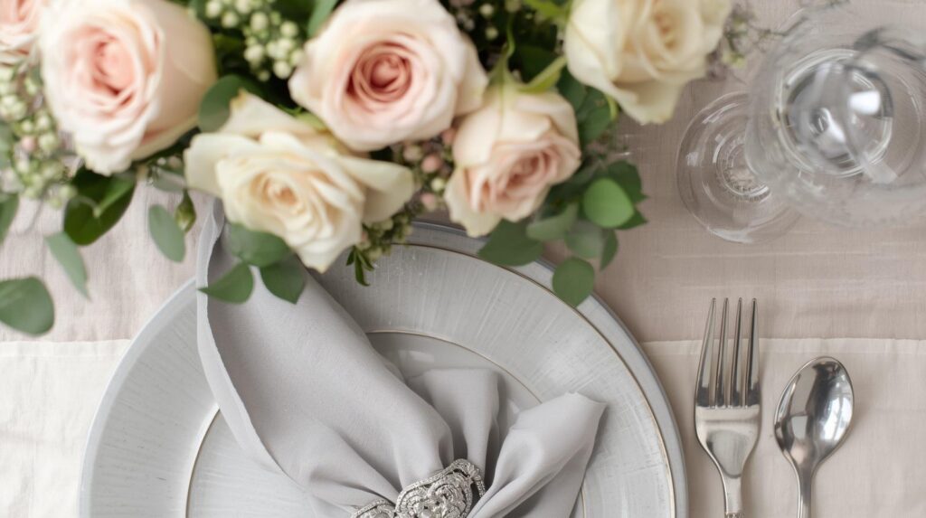
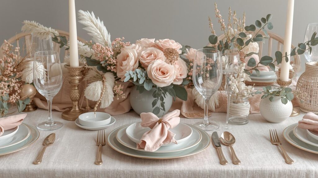
Pale pink is really versatile, but it shines when it plays alongside other quiet colors. Ivory, cream, and sand add depth without adding contrast. Taupe and soft grey make everything feel grounded, while hints of muted green or even dusty rose bring a little freshness and movement to the palette.
Here’s how to pair these shades for an organic, pale pink moment:
- Ivory and Cream: These colors melt right into pale pink, bringing a bright, airy feel. Perfect for table linens or bridesmaids’ dresses.
- Sand and Taupe: Earthy, calming, and a subtle way to add warmth. These shades are nice for ceramics, seating charts, or wrapped napkins.
- Muted Green: Olive, sage, or eucalyptus green always plays well with pale pink. Adding it through greenery or foliageheavy florals keeps the look natural and unfussy. Some favorite floral choices include quicksand roses, astilbe, and lisianthus nestled in silvery greens.
- Dusty Rose: A deeper pink used in small details, like wax seals on invitations or velvet ribbons, ties in with pale pink for a layered, cohesive palette. More pink shades to inspire your palette here.
Organic Florals That Bring Pale Pink to Life
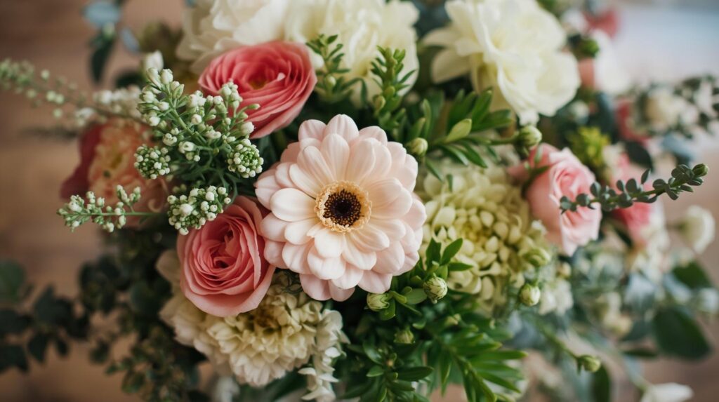
You don’t need perfect symmetry or a dozen identical blooms for this palette to shine. Instead, focus on soft, overflowing shapes and seasonal flowers in a range of pinks, creams, and greens. Some of my favorites are garden roses, ranunculus, sweet peas, and blush peonies. Add delicate white hellebore or creamy stock to keep everything light. For greenery, eucalyptus, olive branches, or foraged vines look romantic without feeling overly planned.
Natural looking bouquets spilling with these blooms, loosely wrapped with silk ribbon, add easy elegance without looking staged. Centerpieces can be grouped at varied heights with a relaxed, slightly wild growing look that captures the outdoors, even for indoor settings. It’s about letting each flower do its thing, giving room for natural shape and movement.
To add another layer of interest, consider adding fruit like blush grapes or soft pear to your arrangement. Fruits can echo muted pink hues while keeping things unexpected and organic. Arrangements with soft grasses or trailing jasmine also lend movement and make everything feel thoughtfully unique.
Using Fabrics to Support the Palette
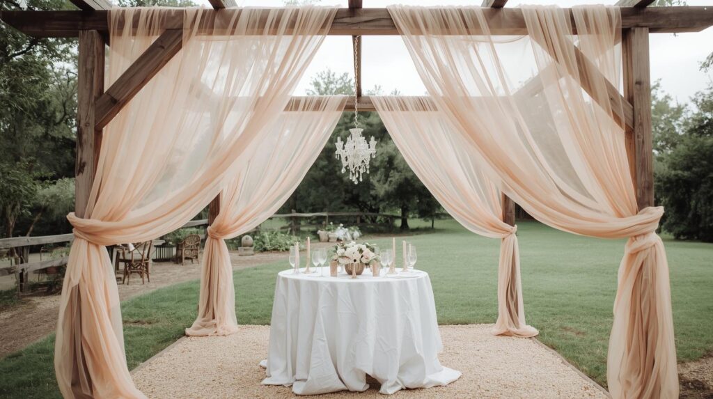
Textiles are one of the fastest ways to step up a pale pink palette. I always lean toward natural materials like linen, cotton, and rawedge silk for tablecloths, napkins, and runners. These fabrics pick up color so gently that even the smallest blush or sand shade stands out just enough. Mixing different textures across tables and ceremony spaces helps everything look collected and authentic, not matchymatchy.
Add a little drama with pale pink draping around an arbor or sweetheart table, or layer creamy throws on chairs for chilly evenings. Table overlays in softly colored linen paired with woven runners can make even a rented hall look inviting and filled with personality.
Stationery with Subtle Layers
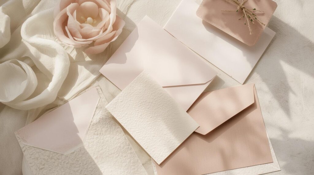
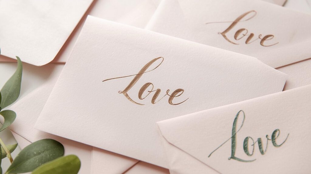
Paper goods set the tone right from the beginning. For an organic pale pink wedding, I would use pale pink envelopes, creamy handmade paper, or soft taupe card stock. Think deckled edges, pressed floral details, or a handdrawn leafy border. Wax seals in blush or rose, paired with muted green ink or simple vellum wraps, look naturally elegant without feeling too stiff. If you’re drawn to the meaning behind pink, check out more about its symbolism here.
Calligraphy in a taupe or muted green ink, watercolor accents, and handtorn paper edges all work together to keep invitations feeling soft and romantic. Even something like a custom illustrated map of your venue in blush tones can add a fun, personal vibe that carries your theme through every detail.
Styling Tables with Organic Beauty
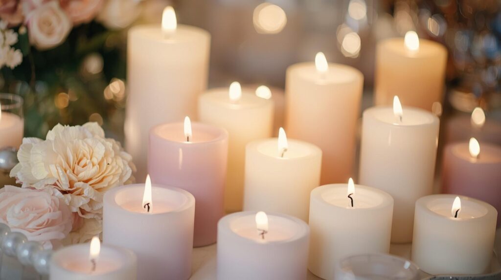
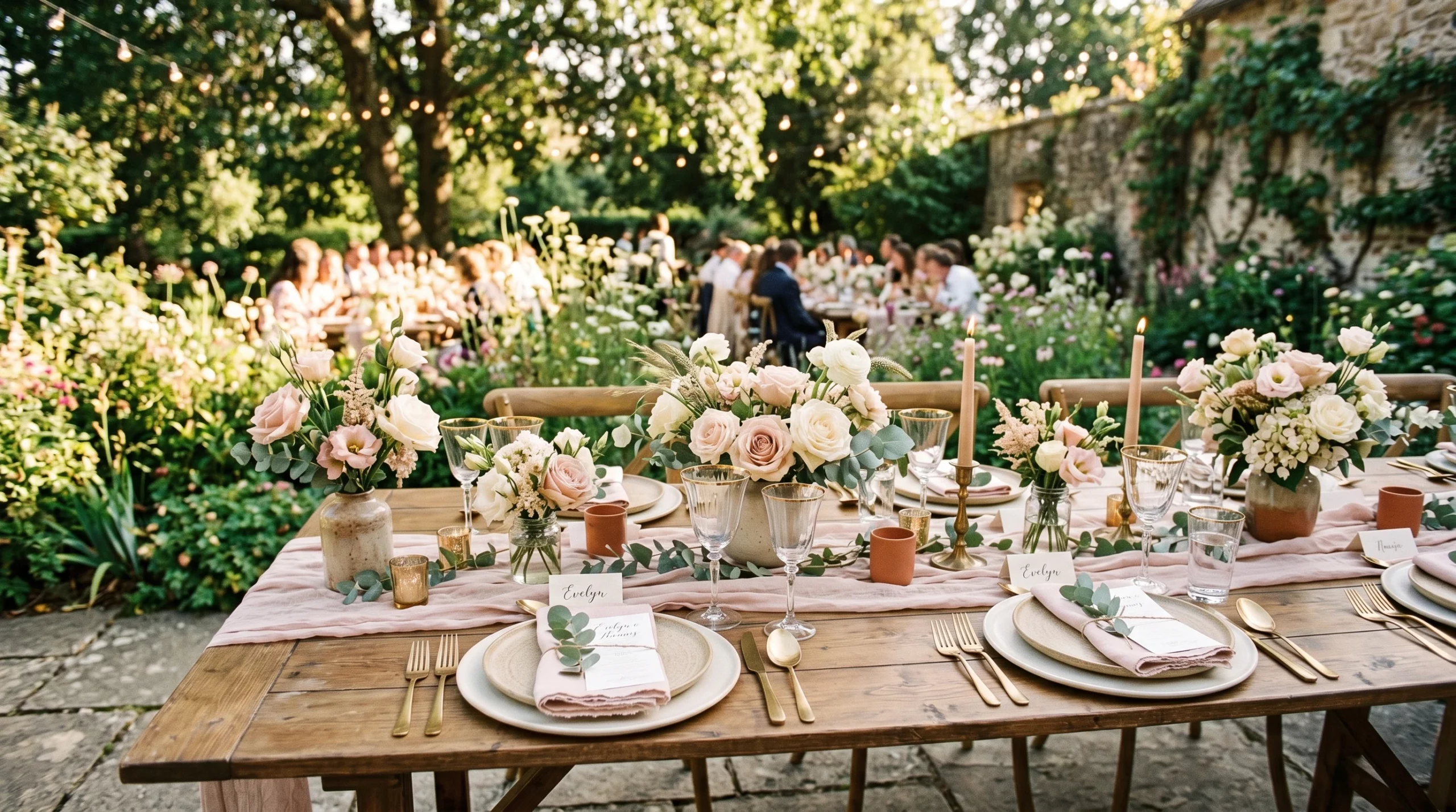
Pale pinks are perfect for layered looks because the color never dominates but always adds warmth. I would recommend starting with neutral plates or chargers in cream or sand, simple glassware, and textured blush napkins. Small bud vases filled with blush and ivory flowers, or even petal confetti on each place setting, look sweet and unfussy.
If you’re adding candles, soft taupe or blush tapers work really nicely. Wooden or ceramic candle holders in organic shapes help keep the vibe grounded and in line with an allnatural look. Menu cards printed on recycled paper or in a dusty rose tie everything together in a subtle yet thoughtful way. You might even tuck a sprig of olive or a single pale pink petal onto each plate for a simple, beautiful touch.
Consider placing small fruit bowls filled with nectarines or lightpink apples at each table for edible decoration. Or, let handlettered place cards in pale pink double as a thoughtful keepsake for guests.
Making Pale Pink Feel Fresh, Not Washed Out
One of the biggest questions: how do I keep the palette from looking faded or too soft? It’s about contrast and using depth, even in an overall light look. Bringing in a bit of warmth with wood accents, textured stoneware, or brushed gold flatware really helps. Playing with the scale of florals, big statement blooms paired with small wildflowers, creates movement and interest.
Lighting makes a world of difference. Natural daylight brings out the true, gentle side of pale pink, but at night, warm candlelight or fairy lights keep things cozy instead of cold. A few pops of a slightly deeper shade, such as dusty rose or muted olive, keep pale pink from fading into the background. Touches of green foliage or even a hint of textured navy—perhaps in menu details or a groom’s tie—add visual interest and help everything stay balanced.
Practical Tips for Pulling Off the Look
- Stick to a limited palette: Choose three to five main colors and repeat variations throughout the space. This keeps everything unified and calm so each color gets its moment.
- Mix textures: Combine smooth linens with textured florals, roughedged paper, and natural materials in your decor. Texture gives depth where color stays subtle.
- Bring in found or foraged items: Foliage from your own yard, river stones as escort cards, or driftwood signage fits the organic theme and feels really personal.
- Keep things local and seasonal: Use what’s in bloom or what feels right for the time and place. This approach brings authenticity and connects your event to its setting.
- Reuse pieces after the wedding: Linen napkins, small bud vases, or even pale pink runners make pretty additions to your home. DIY ideas for leftover pink decor are worth checking out.
- Tie in subtle prints: For an understated twist, layer subtle patterns like watercolor florals or gentle pinstripes in napkins or invites. Pattern stays lowkey but adds even more uniqueness.
Frequently Asked Questions
How do I add pale pink if my space is already neutral?
Bring in pale pink through details like napkins, ribbons, florals, or paper goods. You don’t need to repaint walls or cover every surface. Even a soft pink bouquet or a cluster of blush candles can change the mood and create that special feeling.
Is pale pink only for spring weddings?
Not at all. This color is light and fresh in spring, but looks just as dreamy in fall when paired with muted greens or taupes. Layering with darker shades makes pale pink feel seasonless and natural. As seasons change, simply adjust the accent colors—ivory and eucalyptus in spring, taupe and deep blush for autumn—to keep pale pink going strong all year.
What flowers come in pale pink?
Bouquets and arrangements can feature pale pink roses, ranunculus, peonies, lisianthus, astilbe, and tulips. For more ideas and photos, browse this guide to pink flowers. Hydrangea, cosmos, and carnations are also easy to track down and work well in bouquets and centerpieces.
Bringing It All Together for a Wedding That Feels Like You
Organic pale pink is a feeling that shapes your entire event. The calm, soft energy it brings, especially when paired with other gentle neutrals and natural greens, always makes a wedding day feel welcoming and relaxed. Thoughtful textures, seasonal flowers, and little details like handtorn paper or ribbonwrapped bouquets go a long way in creating that livedin beauty couples want. The result is personal, not forced, so those memories and photos last longer than the day itself. Whether your celebration is grand or small, pale pink sets just the right vibe—it’s timeless, unfussy, and always beautiful.
Leave a Reply