
Psychology Of Pink
 Pink is one of those shades that’s loaded with meaning, and the vibe completely changes depending on whether you’re looking at a neonbright pink jacket or a gentle pastel nursery.
Pink shows up everywhere: in branding, fashion, interior design, and even psychology studies, sometimes in pretty surprising ways. I’ve seen firsthand how the right (or wrong) pink can change the mood of a space or bring out particular reactions in people.
Ever wondered if pink really can boost your mood or mellow out a heated situation? Or why some people see it as playful and others as manipulative? I’ve checked out the psychology of pink, and there’s more to it than meets the eye. Here’s my take on what makes pink tick in our minds, and even why some prisons paint their walls this color to try to cool tempers.
1. How Pink Interacts With Our Minds and Bodies
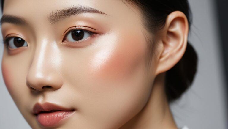
Color isn’t just about what hits our eyes; it taps into something deeper. I’ve noticed that bright, hot pinks can feel lively and energetic, almost like a jolt of caffeine. On the flip side, soft blush pinks come across as gentle and soothing, which is why they’re so popular for bedrooms and spaces where you can relax.
Some color psychologists back this up, pointing out that soft pink shades can help lower heart rate and bring on a feeling of calm. This is part of why pastel pinks pop up in hospital rooms and spas; they add a layer of comfort that other colors just don’t quite match.
Science Behind the Scenes
- Hot pinks (magenta, fuchsia): can feel intense and exciting, sometimes pushing people to feel more social or creative. Too much hot pink, though, and it starts to feel overstimulating.
- Light pinks (baby pink, blush): tend to be perceived as calming, sweet, and nurturing, possibly because they remind us of softness and warmth.
2. Pink as Calming and the Prison Effect
One of the wildest uses of pink I’ve read about is the so-called “Drunk Tank Pink” experiment. In the late 1970s, a psychologist named Alexander Schauss claimed that a very specific pink (later called BakerMiller Pink) could make people less aggressive. Some prisons even painted holding cells in this exact shade, hoping the color would have a mellowing effect on angry inmates.
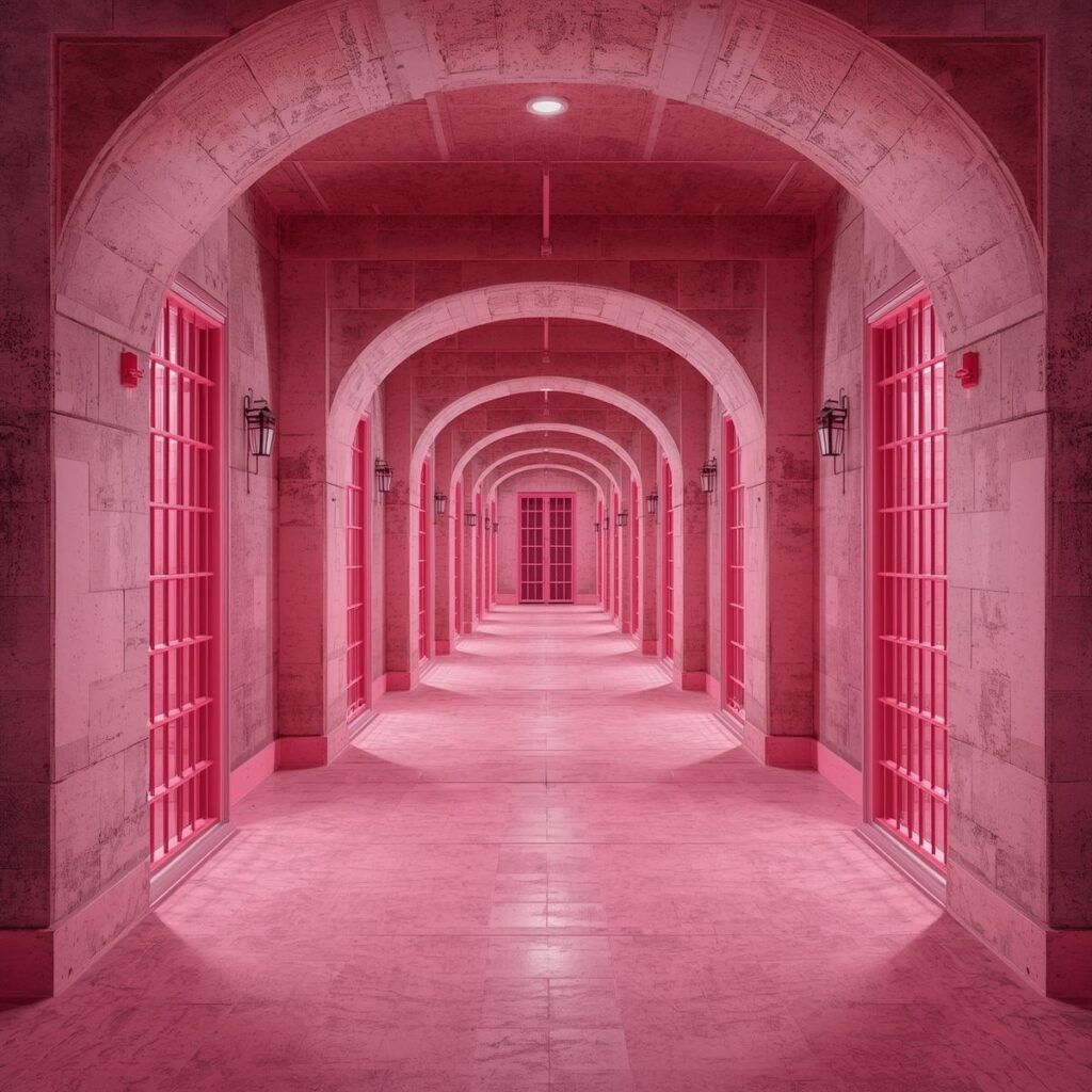
Some staff reported a cooldown in aggression in the first half hour inmates were in the pink cells. However, later followup studies cast doubts on lasting effects. Aggression sometimes bounced right back after a short time, or even went above normal levels if the color started irritating people. The research is a bit mixed, but it proves just how closely color and mood are connected, even in places like jails or mental health wards.
3. What Pink Represents: Gender, Playfulness, and Power
Pink is a pretty loaded color when it comes to symbolism. For much of the 20th century, pink was pushed in Western societies as the goto color for girls, a trend that’s only now starting to get challenged again. Decades ago, pink was even considered a strong, “boyish” color because it looked like a lighter red. How times change!
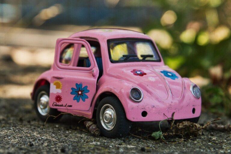
Today, pink isn’t just about gender. I see it used to signal fun, playfulness, and sometimes rebelliousness. Think of hot pink sports cars or edgy fashion brands that want to look bold and quirky. But it can also be seen as a power move; lots of companies use shades of pink to stand out, knowing it gets noticed quickly.

Key Associations
- Nurturing and Care: Soft pinks often show up in ads for baby products and skincare because they’re seen as gentle and loving.
- Femininity & Romance: Thanks to pop culture and tradition, pink is often linked to romance, caring, and femininity.
- Creativity and Individuality: Vibrant pinks are frequently used in fashion or art to signal uniqueness and selfexpression.
4. Pink in Branding: Friend or Manipulator?
I get why brands go wild for pink; it stands out and can instantly change how people feel about a product. Look at TMobile’s neon pink logos or Barbie’s classic bubblegum pink branding. It’s attentiongrabbing and a little bit playful. Sometimes, using a soft pink can make things feel “friendlier” or more approachable, which is great when brands want to build trust.
Check also: Why Is Pink Used In Marketing To Women?
On the flip side, there’s a thing called “pinkwashing”—slapping pink on something to make it look caring or socially conscious, especially around breast cancer campaigns. Sometimes this gets called out for being manipulative when it’s more about marketing than actually helping a cause. It’s a reminder that color isn’t always just innocent fun; sometimes it’s chosen very intentionally to guide your emotions.
5. Pink in Everyday Spaces: How It Shapes Our Mood
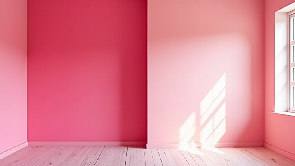
I’ve seen how changing the color of a room, even just a wall, can totally switch up the vibe. A hot pink accent wall in a teen’s bedroom brings an energetic, playful feel, kind of like a lively hangout spot. Baby pink walls, on the other hand, make a nursery feel safe and soft. Here’s how I usually break it down:
When to Choose Which Pink
- Hot pink: Use in creative studios, exercise rooms, or places where you want energy. Good for adding excitement but go easy; too much gets overwhelming.
- Soft pink: Perfect in bedrooms, nurseries, and cozy living areas if you want things to feel peaceful and gentle. Works well mixed with other neutral tones.
A lot of therapists’ offices now use a blush pink or muted rose because the color helps lower social anxiety. When done right, pink can turn a sterile space into one that immediately feels more welcoming and comfortable. In workplaces, pink accents are sometimes thrown in to bring warmth into waiting areas or collaborative spaces, showing off another side to this adaptable color.
In event décor, pink hues are often chosen to set the mood for everything from baby showers to lavish galas. For celebrations, adding pops of hot pink to table settings, floral arrangements, or lighting can make the scene eye-catching and memorable. Pastel or blush pinks, on the other hand, are top picks for creating a gentle, romantic vibe at weddings and dinner parties.
6. Hidden Meanings and Cultural Differences
Pink doesn’t always mean the same thing everywhere. In Japan, pink is tied to cherry blossoms and can suggest new beginnings or the shortness of life. For others, especially in Western cultures, pink is tied to sweetness, love, or even “being soft.” In Latin America, pink churches are sometimes seen as uplifting or sacred. It’s fascinating how a single color can carry totally different messages across cultures and even personal experiences. In some Middle Eastern cultures, pink is deemed calming and reserved mainly for children, while certain places in India view the color as festive, especially during celebrations like Holi.
7. Tips for Using Pink in Your Life
- Balance is key: I like to mix pink with neutrals (like gray or navy) to avoid an overload.
- Think about the shade: Brighter shades create excitement, pastels are more soothing.
- Don’t be afraid to experiment: Even small touches—a pink pillow, a phone case—can switch up your mood or a room’s energy.
- Pay attention to lighting: Lighting can really affect how pink comes across, making it look warmer or cooler depending on the time of day. Natural light often brings out the best in soft rose or blush pink shades.
- Try pink in unusual places: Pink dinnerware, planters, or even socks can add a playful touch to your daily routine without going overboard.
The psychology of pink goes way beyond what you see at first glance. Whether it’s calming or energizing, friendly or strategic, pink taps into our emotions and memories. Next time you reach for something pink—whether it’s a shirt or a paint roller—it’s worth thinking about the mood and message you’re sending, both to yourself and to everyone who walks by.