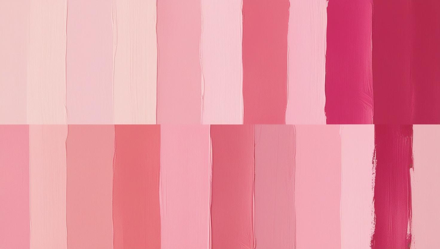
What’s the difference between blush, fuchsia, and salmon? With so many pinks out there, it gets confusing fast. A visual glossary like this makes it a little bit easier for anyone to break down major pink shades.
Pink covers everything from icy, nearly white tints to the wildest of vibrant magentas. If you’ve ever shopped for paint, lipstick, or flowers and felt overwhelmed by all the descriptions, you’re not alone. Knowing the nuances helps you talk about what you want, and makes decorating, styling, or even chatting about art go a lot smoother.
This glossary covers all the main categories, gives you quick reference points, and even highlights how certain shades became popular or meaningful over time. Whether you’re into design, fashion, crafts, or just a fan of pretty colors, there’s something here for you. If you’re curious, hang tight as we get into the super detailed world of pinks!
1. Soft Pinks: Blush, Baby Pink, and Rose
I always think of soft pinks as the gentle side of the family. These are the shades you’ll run into most in baby showers, weddings, and dreamy interiors. They feel light, calming, and cozy, giving any space or design a welcoming feel.
Blush
- What It Looks Like: Slightly peachy, almost skintone, very light pink.
- Use Case: Bridal makeup, spring florals, contemporary home paint colors.
- Cultural Notes: Usually connected with romance, gentleness, and softness.
Baby Pink
- What It Looks Like: Pure, delicate, and pastel. Think of traditional “baby girl” colors.
- Use Case: Nursery decor, toys, cotton candy, and party themes.
- Cultural Notes: Links to innocence and youth, especially in Western countries.
Rose
- What It Looks Like: Warm, slightly muted midrange pink. Sits between red and blush, with a gentler vibe than pure red.
- Use Case: Roses (of course), soaps, perfumes, old-school lipstick, and desserts.
- Cultural Notes: The classic color of love, flowers, and romance in literature and art.
2. Warm Pinks: Peach, Coral, and Salmon
Warm pinks are where things start to feel energetic. There’s a dash of orange in these, giving them a bit more kick than the subtle shades above. These colors show up a lot in summer fashion, tropical decor, and even food packaging. You’ll spot these hues in lively places, festivals, and even makeup trends because of their sunlit energy.
Peach (Soft Pink)
- What It Looks Like: Pink with a sunny, soft orange glow. Looks a lot like the fruit.
- Use Case: Wedding palettes, retro graphics, spring dresses, and popsicle colors.
- Cultural Notes: Symbolizes sweetness and friendship, especially in East Asian cultures.
Coral (Pink Tone)
- What It Looks Like: A strong blend of pink and orange, feels vivid and tropical.
- Use Case: Beach resort decor, swimwear, nail polish, and summer accessories.
- Cultural Notes: Trendy in the 2010s thanks to Pantone’s “Living Coral” color of the year.
Salmon (Rosier)
- What It Looks Like: Midtone pink with coral and an earthy undertone, like the fish.
- Use Case: Casual clothing, kitchenware, restaurant menus, and graphic tees.
- Cultural Notes: Seen as mature yet fresh, balancing fun with a bit of sophistication.
3. Cool Pinks: Orchid, Bubblegum, and Flamingo
Cool pinks go toward the purplish or electric side. These colors tend to stand out in pop culture, tech branding, and bold accessories. There’s something a little futuristic or playful about them. They work great for making statements in digital design or party themes, and are often used to give a next-level cool vibe.
Orchid
- What It Looks Like: Pink with strong purple undertones, inspired by the orchid flower.
- Use Case: Eyeshadow, floral arrangements, wedding themes, and vibrant art prints.
- Cultural Notes: Associated with beauty and mystery in the language of flowers.
Bubblegum
- What It Looks Like: Bright, medium pink, instantly brings to mind classic bubblegum.
- Use Case: Pop art, children’s toys, retro diner accents, and playful stationery.
- Cultural Notes: Strongly tied to nostalgia and fun, used in 50s and 80s design.
Flamingo
- What It Looks Like: Hot pink with a hint of orange and coral, modeled after flamingo feathers.
- Use Case: Pool floats, beachwear, festival fashion, and party decorations.
- Cultural Notes: Reminds people of Miami’s art deco scene and 80s style culture.
4. Intense Pinks: Fuchsia, Magenta, and Cerise
This is the part of the pink spectrum that makes a statement. These shades are super vivid, bordering on neon, and are designed to grab attention. This is perfect for parties, high fashion, and anything you want to make pop. If you want to add creative flair, intense pinks are the way to go. They’re the stars of bold makeup looks, artsy branding, and nightlife scenes.
Fuchsia
- What It Looks Like: Bold blend of pink and purple, named after the fuchsia flower.
- Use Case: Graphic design highlights, club lighting, luggage for easy spotting.
- Cultural Notes: Often used in creative industries and nightlife scenes for its vibrancy.
Magenta
- What It Looks Like: Deep, electric pink with a purple cast, halfway between red and blue on the color wheel.
- Use Case: Ink printing (CMYK), tech logos, experimental art, and music festival graphics.
- Cultural Notes: Became famous with printers and digital art because it’s nearly impossible to mix from visible pigments alone.
Cerise
- What It Looks Like: Very vibrant, reddish pink, a little like cherry juice.
- Use Case: Cocktail dresses, statement shoes, modern nail color trends, and funky accessories.
- Cultural Notes: Seen as bold and assertive, it pops up in avant-garde fashion.
5. Dusty Pinks: Mauve, Antique Rose, and Shell
These are the “vintage vibes” pinks. They feel muted, soft, and a little bit gray, making them easy to use in more relaxed or classic spaces. Tons of wedding, interior, and craft projects use these shades for their understated charm. If you’re after a calming or timeless atmosphere, dusty pinks are a top pick. They blend seamlessly with neutrals for a cozy look.
Mauve
- What It Looks Like: Gray-pink with purple hints, almost antique-looking.
- Use Case: Bridesmaid dresses, shabby chic furniture, retro graphic design, and vintage textiles.
- Cultural Notes: Named after the French word for mallow flower, big in Victorian fashion history.
Antique Rose
- What It Looks Like: A faded, brownish pink with a vintage touch.
- Use Case: Wallpaper, letterpress invitations, historical costumes, and floral arrangements.
- Cultural Notes: Popular with people who love all things vintage and timeworn.
Shell
- What It Looks Like: Pale pink with a touch of creamy beige, like the inside of a seashell.
- Use Case: Bathroom accessories, ceramics, nature-inspired art, and beach-themed decor.
- Cultural Notes: Gives a soft, coastal feel; shows up in beach cottage decor.
🔥 Trending or Iconic Pinks in 2025
Millennial Pink
Barbie Pink
Digital Lavender Pink
Pink Clay
Cherry Blossom
Neon Pink
6. Pink in Language, Design, and Culture
I find it interesting how pink shades show up in language and culture. “In the pink of health” means feeling super well. “Tickled pink” means happy. Pink ribbons stand for breast cancer awareness. In design, pink is used both for softness and playful energy, depending on which shade is chosen. And in some cultures, pink isn’t always gendered. It can even be a color of luck or power!
Beyond just looks, pink shades have been used to communicate hidden meanings and social signals for ages. In Japan, for instance, certain pink tones symbolize the fleeting beauty of cherry blossoms. In contrast, bright pinks in the West often signal playfulness or rebellion in music and pop art. Pink’s popularity in youth cultures, fashion runways, and digital apps proves it really can set a mood or send a message, just by changing its tone.
Final Word on Pink Terminology
Loving pink’s full potential is all about knowing your blush from your magenta. With this glossary, I hope that it’s easier and more fun to pick the perfect pink for any mood, project, or vibe you want. The right pink can liven up a room, set a mood, or share a message without a single word. There’s a shade for every style, once you know what you’re looking for. If you ever find yourself debating between salmon and bubblegum or cerise and antique rose, just come back to this guide and you’ll find your answer in no time. The next time you walk into a paint store, flower shop, or design meeting, you’ll pick up on every subtle shade and put your pink know-how to work!
Leave a Reply