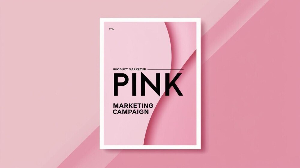
Why Is Pink Used In Marketing To Women?
Pink razors, pens, bubblegum packaging, rosy gadgets … brands lean on the color pink for products they market to women. This sparkly palette might spark excitement or an eye roll, but a lot is going on behind these color choices, including data, brain science, and even some hefty cultural baggage.
If you’ve ever wondered why pink seems to rule the women’s aisle (and why it sometimes comes with a higher price tag), pink in marketing is packed with strategic thinking, social cues, and plenty of debate.
This guide unpacks why pink is such a popular tool in advertising to women and explores what it means for shoppers, sellers, and, honestly, anyone who’s tired of seeing everything turned into bubblegum hues for no good reason.
To get a bit deeper into the reasons why the color keeps showing up at the store, let’s get into how it became a staple, how it affects buying habits, and what might be next for pink on the shelves.
The History of Pink: From Neutral to Gender Marker

Pink wasn’t always the go-to for products aimed at women. If you look back at old catalogs and ads from the 19th and early 20th centuries, you’ll spot boys in pink smocks and girls in blue ribbons.
The stereotype of pink for girls and blue for boys only really locked in during the mid-1900s.
Plenty of sources, like Smithsonian Magazine, trace this to American department stores promoting the divide, ramped up by massive post-war retail campaigns.
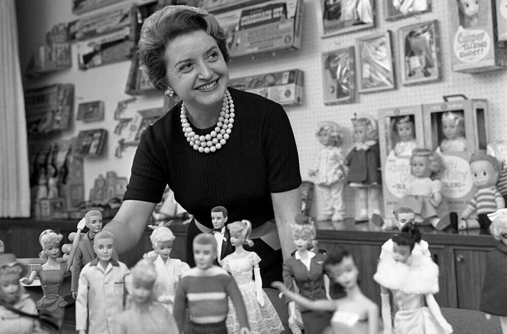
Branding teams started realizing that pretty packaging and pastel shades could move products. When Barbie hit shelves in 1959, companies saw just how much pink could sell. That trend snowballed, and soon pink became the default signpost for “this is for women,” whether it was toys, perfumes, or entire store aisles.
Over the decades, pink took on new connotations. It became tied to femininity in Western pop culture, signaling not just a product but a whole identity or lifestyle. Pink uniforms for breast cancer awareness, pink ribbons for charity, and pink gadgets as special editions all added layers to how society views the shade, even making it an icon for empowerment and activism at times.
The Psychology of Pink in Advertising
 Color is a form of silent messaging. Studies show that people associate pink with warmth, softness, nurture, sweetness, and sometimes even luxury.
According to the Pantone Color Institute, light shades of pink generally spark feelings of calm and comfort, which brands tap into when they want to make a product feel approachable.
Advertisers learned early on that color could build trust, spark impulse buys, and make shelves pop. Pink, in particular, is used to trigger classical conditioning. When people see it, their brains link it to products “made for women,” even if there’s nothing inherently gendered about the product itself.
Common Brand Tactics Using Pink
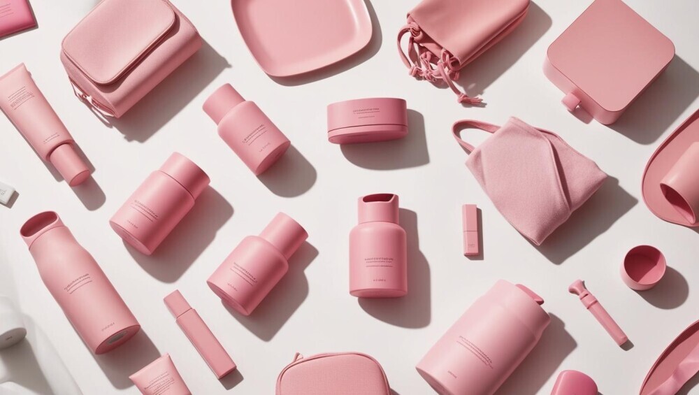
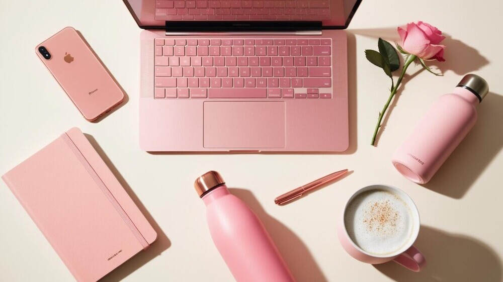
- Gadget and tool brands are swapping classic black or blue designs for pink, signaling a “feminine” version.
- Pharmaceutical packaging using soft pinks to imply gentle effectiveness or empathy.
- Personal care and hygiene products put pink front and center for instant shelf recognition.
Pink is also often picked for seasonal or promotional products—think Valentine’s Day gifts or Breast Cancer Awareness Month editions. These occasions let brands set pink products apart, making them limited-edition or “collectible” for shoppers looking for something new.
Market Data and Buying Habits
Surveys and sales data often suggest women respond more positively to pink—or at least, that pink packaging can boost buying rates. According to some marketing reports, products with pink packaging in the beauty and personal care aisle can see higher sales, especially among younger consumers.
Pew Research and other polls show that not all women prefer pink, but the perception that it signals “for women” is widespread enough that it shapes retail strategy. Many brands are also influenced by data showing parents are more likely to grab “girl-coded” products, sometimes simply because they think it’ll make gifting easier or guarantee their child’s approval.
It’s also interesting to note that while pink is frequently linked with women in the U.S. and Western Europe, color associations can differ in other regions.
In Japan and South Korea, for example, pink is linked to springtime and good luck, so international brands sometimes adjust their color strategies according to local tastes and meanings.
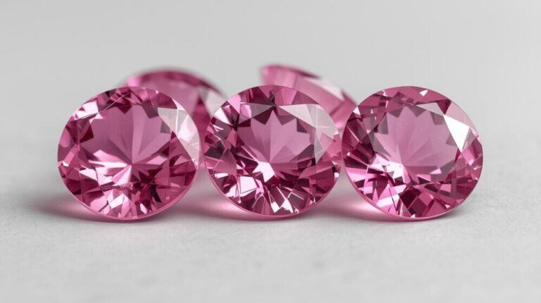
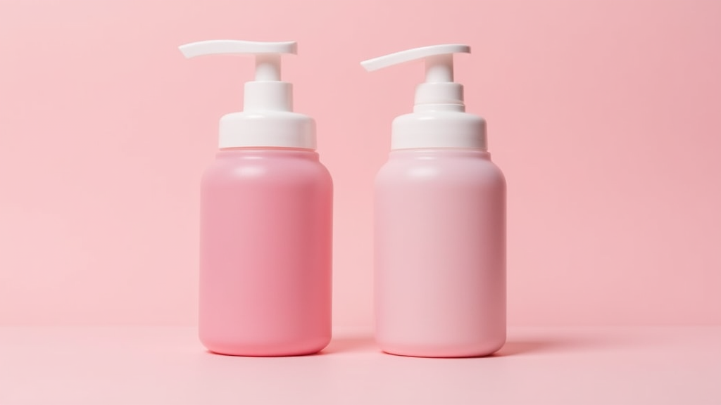
The Pink Tax: Does Pink Really Cost More?
One of the most talked-about problems with pink marketing is the “pink tax.” This refers to the price gap where identical or nearly identical products are sold for more money if they’re packaged or marketed “for women,” which often just means they’re pink. Common examples include razors, deodorants, and school supplies.
The New York City Department of Consumer Affairs ran a study and found that products for women or girls cost about 7 percent more than comparable items for men and boys.* This effect pops up in everything from clothing to kids’ bikes to shampoo, sparking criticism and calls for brands to close the price gap.
Everyday Examples
- A pink ballpoint pen is priced higher than an identical blue one.
- Shaving razors with pink handles sold alongside cheaper “men’s” versions in different colors.
- Personal care items, like lotions, with gendered packaging but identical formulas, tagged with different prices.
For more info, check out resources from Consumer Reports and the Government Accountability Office, both of which have dug into examples of this phenomenon.
This price gap isn’t just a minor annoyance; for some shoppers, it adds up over a lifetime. Women may end up spending hundreds of dollars more just for the color of a package, even when the product itself is virtually the same. Over time, this has sparked lawsuits, online campaigns, and major headlines as folks try to get companies to drop these price differences.
The Cultural Debate: Stereotypes and Backlash
Pushing pink products stirs up plenty of conversation about gender norms. Many shoppers are frustrated by the idea that a specific color defines what women or girls should like. Feminist writers and marketing experts have called out these tactics, arguing that they reinforce outdated stereotypes instead of broadening choices.
This frustration has even sparked entire movements and viral hashtags (like #genderneutralcolor) where people share their experiences with unnecessary pink products and call for color-inclusive marketing. Brands like Billie (razors) and gender-neutral kids’ toy companies are responding with more varied color palettes and price equality.
Media and advocacy groups have also weighed in, publishing studies and op-eds about the issue. Some retailers have introduced new guidelines to stop gendered pricing. Meanwhile, conversations about pink merchandise have made people more aware of how marketing choices affect everyone, not just women.
Why Pink Still Sells (and When It Backfires)
Pink continues to be a top pick in advertising because it stands out, catches the eye, and immediately fits existing gendered shelves.
In crowded retail spaces, grabbing shoppers’ attention matters, and years of marketing have trained people to link pink packaging to “for women.”
But using pink isn’t always a win.
If shoppers feel like brands are talking down or just trying to charge more, trust can drain fast. More consumers now look for companies that give real choice and don’t just swap color and hike prices.
For retail brands, striking a balance between catching the eye and treating shoppers with respect is important. There have been some famous fails when pink products didn’t land.
Remember when tech brands released pink laptops, assuming women preferred color over specs? Reviews panned these releases, and sales tanked. Simply making things pink isn’t enough—consumers want solid quality and thoughtful design alongside color choices.
Rethinking Color: What Shoppers Want Now
Lots of modern shoppers want a break from the one-size-fits-all pink approach. When brands offer options—for example, bold orange, sleek grey, or just plain unbranded—women and girls notice.
Many consumers say they feel more respected and lifted when they can choose their colors, and sales data is starting to reflect that switch-up.
The good news is, more brands are listening. Colorful options in everything from gaming gear to personal care products show that marketers are updating their playbooks.
And as the marketplace gets more diverse, pink will probably become just one color among many rather than the stamp of “for women.”
Today’s shoppers often use social media to call out brands with stale color schemes and praise those that break the mold. This feedback loop means companies aren’t just guessing—they’re learning in real time what buyers want.
Customization features let customers pick their preferred shades, and the response has been enthusiastic. Even toy companies and sports brands are leaving old standards behind in favor of choices that feel modern and open.
Final Words: Color Freedom Is Super Important
Packing everything in pink is a marketing habit with a long backstory and a lot of baggage. While pink taps into psychological triggers and can move products, shoppers today are waking up to the price hike and the stereotypes baked into so many rosy packages.
If brands want lasting fans, variety, transparency, and color freedom are super important. Pink’s place in marketing is changing, and that’s a trend that feels worth watching.
Bottom line: The power of pink isn’t disappearing overnight, but more people now see it as an option, not a rule. As brands catch up with changing attitudes, the future for color in shopping could be a lot brighter—and a lot less predictable—than ever before.